The Portal is a comprehensive school management tool utilized by NYC public schools and over 200 housing shelters, streamlining access to student data for educators.
The aim is to empower educators with efficient data access, eliminating the need for manual collection and analysis.
The Portal aims to expand beyond NYC. However, before pursuing further expansion, stakeholders identified a need to improve the UX/UI of key features throughout the Portal.
The Student Profile is the most visited page in the Portal, offering a detailed view of a student's data across major content areas. Recognizing its importance through user feedback
and analytics, the Student Profile emerged as a key focus for redesign.
The goal of the redesign was to introduce a clear information hierarchy, enhancing the user's ability to quickly assess a student's progress across various content areas.
Drag slider to view the Student Profile before this project and after this project.
At the project's start, we identified two pain points based on user research and stakeholder feedback: navigating through data-heavy panels and reducing the height of the Student Profile header.
With 12 data-heavy panels, it's cumbersome to go to a particular panel. Users get around this by collapsing all panels to see which panels are available, then navigating to the desired panel.
Many of our users access the Portal through their school's Chromebooks. This means that many of our users are viewing the Student Profile on a resolution of 1280x780. Vertical space on this page is valuable and the current page header takes up a sizeable amount of real estate.
Defining success
The next step was to refine our understanding of the "ideal" Student Profile experience and align the product team on a shared vision.
To accomplish this:
I organized brainstorming sessions with the product management team and the Head of Design to help define long-term and short-term goals for the Student Profile design.
I interviewed product managers from different verticals to gather insights on user needs and workflows. This was crucial, given that the Student Profile comprised 12 panels,
each developed independently by different teams, resulting in siloed knowledge about their design.
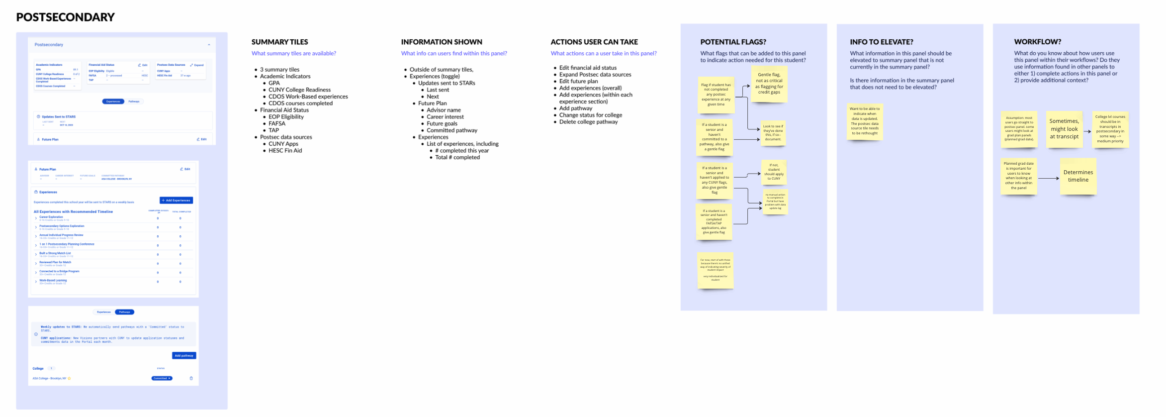
This is a sample Insights board for the Postsecondary panel in the Student Profile. Similar boards were made for each panel, outlining available panel information and leaving space for notes from interviews with product managers, documented using stickies.
* * *
Approach
Due to the amount of feedback received, I split the redesign work into phases. The goal of phase 1 was to introduce a design with a clear information hierarchy and strategic nudges to the user.
Phase 1's four main design deliverables:
Explore a new layout.
Introduce navigation for easy panel access.
Rethink the Student Profile header, reducing its height.
Add an overview section for a quick progress summary.
Exploring a new layout
I started by creating three blockframe options. I prioritized navigation space and addressed the user pain point of overwhelming data by considering an 'action items' section for actionable next steps. From there, I created three low-fi wireframes to share with stakeholders.
Before going straight to low-fidelity wireframes, it was helpful to start with more exploratory blockframes to play around with the layout of the page.
Stakeholder feedback showed that the navigation in the third option was more intuitive and easier to parse through. I decided to move forward with the third option and converted the design into a two-column layout for future mobile responsiveness.
The final design incorporated integrated action items into the navigation using notification badges.
The final page layout.
New way to navigate
Utilizing product analytics and insights from the product team, I designed a left-hand sidenav for the Student Profile. The order of panels reflects common user workflows and click rates.
To enhance visual appeal and reduce text density, I incorporated icons into the navigation.
(Left) The sidenav for 6-12 schools, (Right) The sidenav for K-5 schools
Moving the history log
To accommodate the new navigation, I relocated the history log to a new panel. Despite some pushback from the product team on relocating the history log, I decided to proceed, aiming to collect user feedback during testing.
Simultaneously, another team was implementing a task management system for the Portal and there was a need to show tasks assigned to a student within the Student Profile.
I collaborated with their designer, adding tasks to the new history log panel (now called Tasks and Notes) and incorporating pagination to maintain consistent panel height.
The new Tasks and Notes panel lets users switch between viewing assigned tasks and written notes for the student. Users can also toggle to Activity to see metadata related to actions taken on the student via the Portal.
Revamping the header
To reduce the header height, I crafted mockups condensing the information into two lines. In line with discovery phase findings highlighting the need to alleviate the data-heavy nature, I introduced color to the header of this page.
The finalized Student Profile page header.
Adding a student snapshot
To enhance the Student Profile's information hierarchy and discoverability, our central goal was to create a narrative for the student's performance across different content areas. Insights from product manager interviews
guided the content for a new student snapshot panel at the top of the page. This panel offers a summarized overview of the student's data, enabling users to click for further exploration.
The student snapshot panel for High School (left), Middle School (center) and Elementary School (right).
* * *
User insights
I created an interactive prototype, which included two versions to a/b test with participants.
One version featured a static page where users could click into the panel, introducing a new flow. The other allowed seamless scrolling from panel to panel, preserving the existing flow.
The feedback was unanimously positive, with only minor design adjustments needed.
"It looks cleaner. I like how the information is presented and now I can go straight to the panel I need to go to. I like how everything is now
spelled out and just laid out easier."
Key insights Include:
Participants highlighted the significance of scrolling between panels, particularly for tasks like adding a graduation plan. Maintaining this scrolling capability was deemed essential.
I received a lot of feedback from participants about the information available in the student header, which helped define with metrics were crucial.
Surprisingly, participants found the new history log/notes panel more discoverable, with some perceiving it as a new and exciting feature.
This positive response confirmed the validity of relocating the history log to a new panel.
* * *
Final designs
The Student Profile page for High School (left), Middle School (center) and Elementary School (right).
* * *
Impact
It's still the early days since the launch of this redesign, but we've received overwhelmingly positive feedback from users. There also has been a noticeable uptick in user traffic to the Student Profile and a corresponding increase in time spent on the page since the launch of the updated Student Profile.
Since the launch, the average of individual Student Profile views per user have gone up 100%.
The new Student Snapshot panel has also had 800 unique clicks by users in the first month post-release, while the other panels have an average of 400 clicks by users.
* * *
Takeaways
In four weeks, I undertook a significant overhaul of the Student Profile in the Portal to address usability challenges systematically. Handling a tight deadline and numerous redesign possibilities, I learned how crucial it is to take a phased approach when tackling a project this large. Collaborating closely with stakeholders and seamlessly
incorporating features from other teams made it a collective effort. The revamped Student Profile isn't just updated; it's now user-centric, polished, and adaptable.